
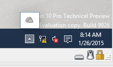
I had some fun this morning downloading and playing with the new Tech Preview of Windows 10, which was unveiled last week. Here are a few screenshots to walk you through some of the changes in the interface. All in all, I thought they were fairly minor changes from Windows 8, most of them subtle improvements. (Although I’m going to have a hard time getting used to the new funky folder icons!)
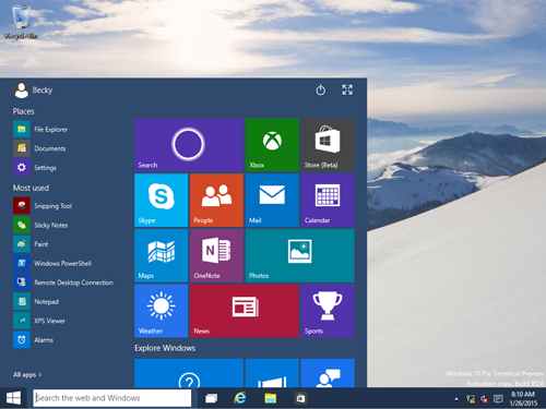
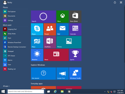
The first thing to note is that the “Start Menu” from Windows 8, which was more like an entire browsing experience, has returned to its previous and beloved position. I personally never had an issue with the Live Tiles and wasn’t too upset to see the Start Menu go, but this is at least a nice compromise between the two; it’s like having the Windows 8 Start Menu embedded in the Windows 7 and previous start location. The Live Tiles sit side-by-side with the traditional shortcut list.
You aren’t really going to see the word “Favorites” anymore it seems, but you’ll see “Places” and “Most Used” by default. If you want to see all your links, click on the All Apps link.
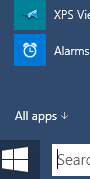
This will open up an alphabetical listing of all your apps. If you have a number of larger live tiles you’d like to see, you can actually expand the Start menu to stretch across the full screen.
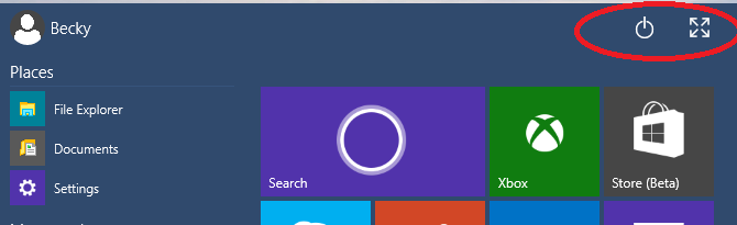
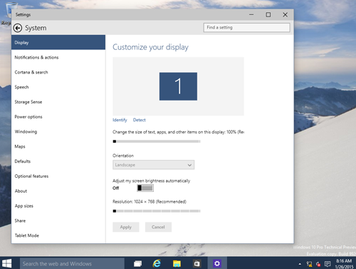
One of the things that caused people the most confusion with Windows 8 was the fact that the Power button had moved away from the Start menu. It’s back, although not where it used to be. You can find it at the top right of the Start menu.
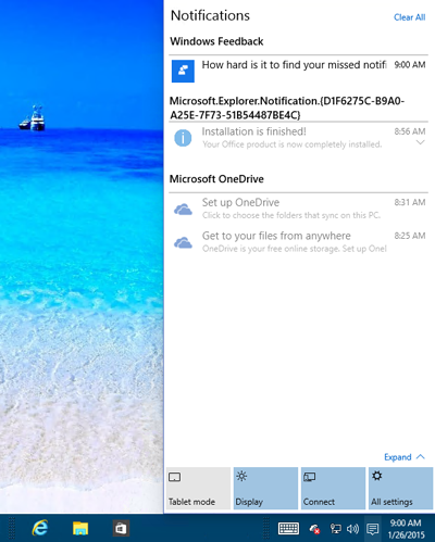
Speaking of moving the Power button out of the settings, you’ll notice that the way the Settings works is slightly different now, too. You’ll notice that in your Task tray at the bottom, you’ll see a new little icon that looks like a chat icon. (As a side note, you’ll see that OneDrive is installed by default if you use the default installation settings.)
When you open it up, it will slide out a more comprehensive window of what’s going on with your system and a place to make changes.
Apps work slightly differently now than in Windows 8. Win8 first introduced this concept of a Windows Store App vs any kind of app that had come before. While the reasoning behind it was to emphasize that these new apps were fundamentally different, to end users, it was complicated trying to figure out how to jump from Windows apps to the desktop. Although the split screen few was a helpful feature of Windows 8, it apparently still isn’t as efficient as the good ol’ desktop in terms of allowing people to quickly switch between the various windows they have open. (I would say that goes for me, too.) So, now, when you open an app, it doesn’t automatically monoploize your whole screen; it will now show up in a new, more traditional, window, with a nice header, like this (as seen when popping open the Settings menu from the previous screen shot):
Two more interesting things to note:
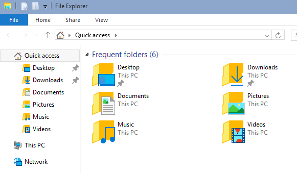
First, the file explorer has been reworked with new, funky icons:
The next thing to note is that Cortona is “baked” into the UI. While we’ve become familiar, as a culture, to utilizing voice-activated commands with our phone, this is the next leap to see if we can, as a people, learn to adopt voice commands with our computer. (I confess that I tried to install the previous version of voice commands on my computer but couldn’t bring myself to remember the different commands to tell the computer what to do. I think this Cortona thing will only work if it can figure out what I’m talking about. It’s all about the intelligence of it as to whether it’s usable or not. Time will tell.)